Elements in templates
Legacy elements
Text field
We recommended using blank inputs instead of the legacy text field.
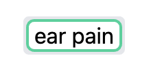
A text field is a short area where you are prompted to enter some text.
Checkbox
We recommended using buttons instead of the legacy checkboxes.
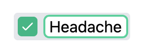
A checkbox is a field that is optional.
When you check a checkbox, its text is included in the output note.
If a checkbox is left unchecked, its content won't be visible in your note.
In Dilato, checkboxes can also be in a negative check:
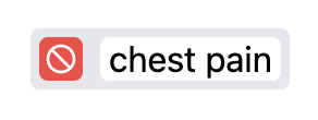
When checked as a negative, the checkbox's content will be in your note but, unlike a regular check, Dilato will add the "no" prefix just before the text, to indicate its negativity. This prefix is customizable from the Settings.
To check a checkbox in the negative state, right-click the box.
Dropdown
We recommended using buttons instead of the legacy dropdowns.
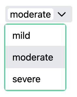
A dropdown field is a list that contains options to choose from.
To view the list of choices, click on the dropdown. Then select the choice you wish to appear in your note.
Feel free to edit the selected choice if you need to.
If you don't want any of the choices to be displayed, you can leave the dropdown field empty.
Multi-Select Dropdown
We recommended using buttons instead of the legacy multi-select dropdowns.
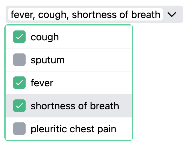
A multi-select dropdown is a list similar to the dropdown above, with the extra ability to have multiple choices selected.
You can check as many options as you like. Multi-select dropdowns also support the negative check (right-click the boxes).