Elements in templates
Button
Using Buttons
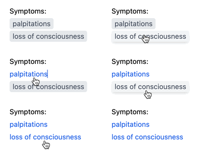
Buttons are inline elements within templates that turn into text when clicked. Buttons are not in the output note unless you click them. Here’s how to use them:
Below is an overview of buttons’ capabilities when filling a template:
-
Click to turn a button into text.
-
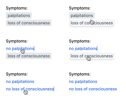
Right-click to turn a button’s text negative (or use Alt+Click on Windows and ⌥Click on Mac):
-
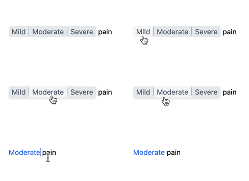
A button can contain multiple choices. Selecting one choice makes the others disappear:
-
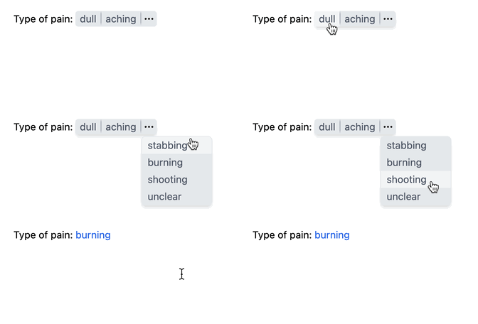
A dropdown can be attached to a button with more than a few options. Press ‘⋯’ to view and select in the dropdown:
-
After selecting a button, you can still change your choice by clicking the blue text:
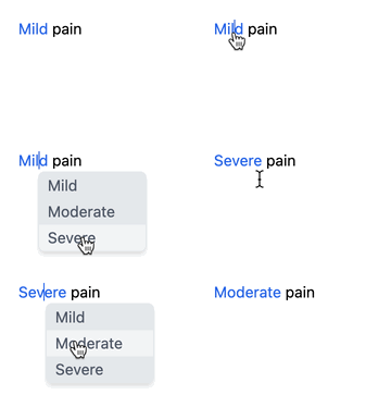 (Additionally, you can open other choices by placing your text cursor in the blue text and pressing Alt+↓ on Windows or ⌥↓ on Mac.)
 -
Select multiple choices by holding the Ctrl key on Windows or the ⌘ key on Mac:
 (Releasing the Ctrl or ⌘ key will turn your selections into text.)
Adding Buttons
Incorporating buttons into your templates is easy. First, make sure you are editing the template.
Follow these steps:
-
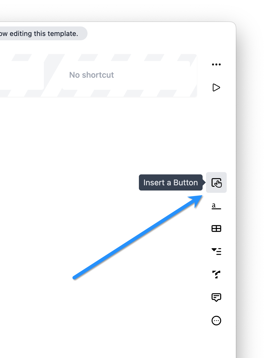
Click the button icon in the toolbar:
-
The button will be added at the cursor location, allowing you to enter the button’s text. Press Enter to add another option:

Alternatively, you can select text and press the button icon to convert it into a button:
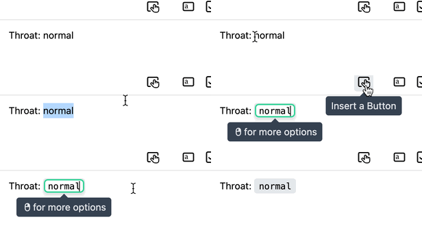
If the selected text contains commas, they will act as separators, creating a button with multiple options:

If the selection spans multiple lines of text, a button will be created on each line:
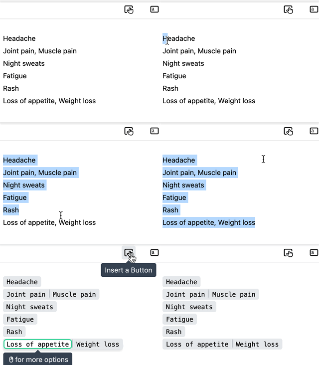
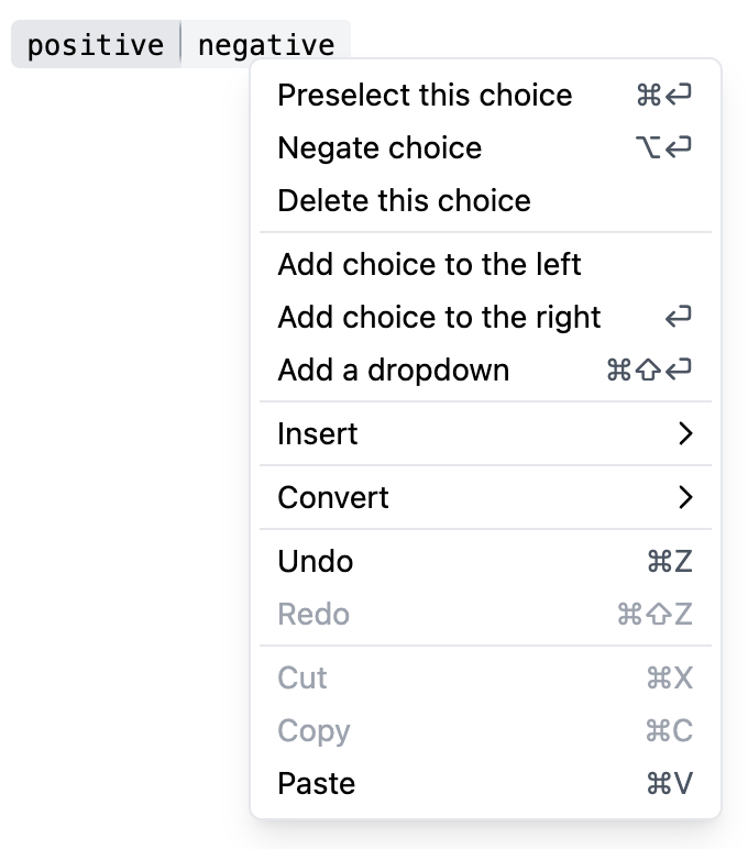
Right-click on a button to open the context menu for additional actions:
Tips
- No need to capitalize the first letter of a button at the start of a line—Dilato automatically capitalizes the first letter in the final note. This is especially useful when negating a button, as ‘fatigue’ becomes either ‘Fatigue’ or ‘No fatigue.’
- You can attach clickable texts to buttons.